Do Your Thing (Wild & Free)
- Nov 1, 2019
- 2 min read

Hello, and welcome back to my blog! It’s the first of November today, and as I am the featured double page designer at Stick It Down this month, my layouts are going up on the blog today!
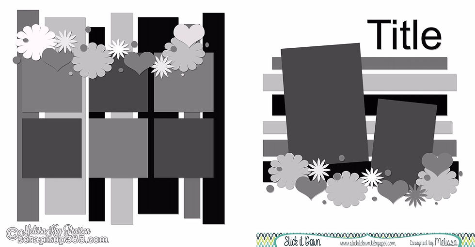
I wanted to create something with a little bit extra for this occasion, so I decided to do a (sort of a) tutorial about interpreting sketches. I am a firm believer that sketches should be there to help, rather than hinder you, so I decided to show you three different takes on November’s double page sketch, with varying complexity and adherence to the original. Here is the sketch:

Today, I will be focusing on the first layout, which is a super easy and super quick one for my travelers notebook.

There are times in everyone's life when things get so busy, and we just haven't got enough time to create something intricate. It's a good idea to simplify the process a bit, in order to reach our goal: to get that memory onto (patterned) paper, and into the album! To achieve this, I used striped paper for the background - you still get the horizontal and vertical lines on the layout, but it takes only a fraction of the time it would to cut out and arrange paper strips.

I flipped the placement of the photos, rather than the whole sketch. I only used one medium sized photo on the left, and replaced the smaller photo with a tag for journaling. The grid is on the right hand side, but the orientation is different from the sketch. I replaced some of the photos with sentiment/ journaling cards.

I went completely off tangent with the embellishments on this layout. Rather than working in a horizontal and a vertical line, I created small embellishment clusters and dotted them randomly on the layout.

I used embellishments from several different collections, but I tried to keep some consistency by repeating certain things: the flowers, the butterflies and the sentiment stickers.

So, when creating this layout, I adhered to the sketch by using horizontal and vertical stripes, a grid of photos on one side, a focal photo on the other side, and flowers and hearts as embellishments. I diverted from the sketch by flipping the placement of the photos, replacing some of the photos with sentiment/journaling cards, and being completely random with the embellishments. As a result, I created a layout, with came together super-fast, suits my purposes, tells my story and pleases my eyes. Success!

You can check out my process video / tutorial with all three layouts, so you can see the difference in approaches and end results. I will be putting up a post about the other two layouts in the next two days. Don't forget to check back to the Stick It Down blog next Monday to see what the other members of the double page team have created! Thanks for visiting!


Comments