
Harvest Fun
- Mar 5, 2019
- 3 min read
Hello and welcome back to my blog! I have been so inspired by this month's double page sketch on the Stick It Down blog that I have created two layouts with it! Today I will be showing you the first one, which is a traditional 24" x 12" layout:

And here's the sketch I have used:

This layout was designed to go with another two-pager I created last year:

The two layouts are parts of the same story, but whereas the one tells the story of a family day out, the other focuses more on my daughter. Accordingly, I wanted the two layouts to be coordinating, but not necessarily matching.
To achieve this, I chose papers for the current layout that are coordinate with the other one in colour and tone, but the pattern and feel is less Autumnal and more girly.

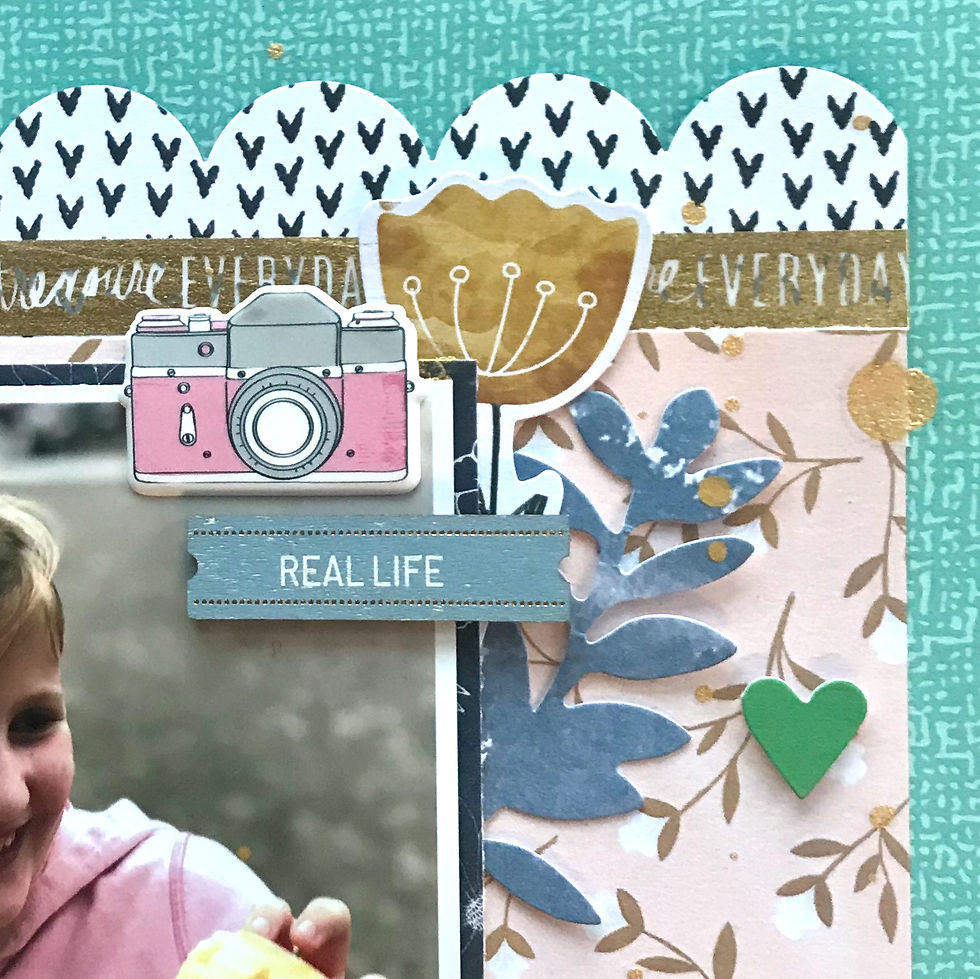
I chose a solid card stock background, which is only visible at the edges. Next, I layered patterned papers in strips. The widest one with the hearts on is from an older Pinkfresh Studio range. I've been saving this paper for a while, waiting for the perfect opportunity to come along to use it. It's such a lovely paper, but the pattern is very bold. Using it on a 12" x 12" layout would be tricky, as it's so busy. Also, I wanted it to be visible as much as possible, as I really like the sentiments written in the hearts. So using it as two 6" x 12" strips on this double layout was ideal.

I used a soft floral pattern for the next strip - it's coordinating in colour with the other one, but the pattern is much less dominating. Perfect as the background for the photos. I finished the layering with a strip at the top and one at the bottom - I used my large scallop edge punch on these. The gold strip at the bottom is punched out from gold foiled vellum. To repeat the gold accent at the top, I used a narrow Heidi Swapp washi tape. This is my fave washi at the moment, it repeats the sentiment 'treasure everyday'... it's sooooo lovely...
The shape and orientation of the photos is the same as on the sketch, but I changed their order to suit my purposes. They are also smaller, so I added and extra square of patterned paper for the title.

I changed the placement of the journaling - it felt right to place something at the bottom, as the layout felt as if it was 'floating'. The journaling box is quite chunky, so it was just right for 'anchoring'.

Next, I created three embellishment clusters in a triangle. This design rule seems to work well for me, and I use it on most of my layouts. I used very small clusters, as the background is quite busy. Also, I am quite literal in my embellishing, and I didn't have many embellishments that suited the theme.
I hope you like my layout. Don't forget to check out the SID blog for loads more inspiration. I also have a process video for this layout on YouTube. I will also be doing another blog post soon on my other layout, which is a different format and different interpretation of the sketch. Thanks for visiting!


Comments